Simplifying Account Management
Redesigning a fragmented account experience into a simpler, more user-centred product.
- 0→1
- Consumer Product
- Founding Design
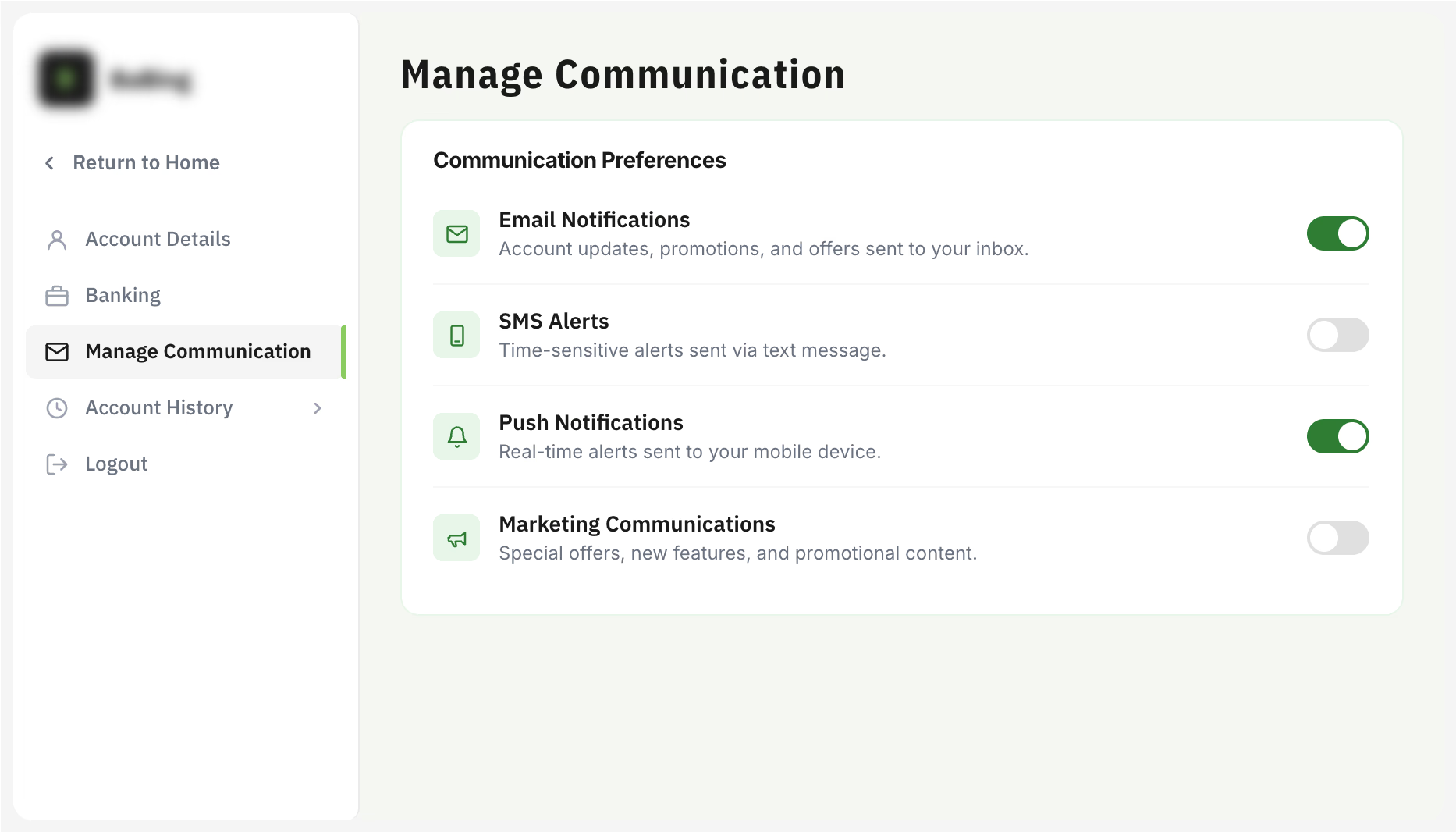
Visuals have been recreated due to confidentiality restrictions.
- Role
- Founding Product Designer
- Scope
- Account management across two products and six brands
- Target
- Scalable, consistent account experience across a growing multi-brand platform
My Contribution
- Joined as the first designer, establishing product design foundations during rapid growth
- Led the end-to-end redesign of the account management experience
- Defined scalable patterns and information architecture across products and brands
- Collaborated cross-functionally to improve UX consistency
Key Outcomes
- Simplified account journeys into a clearer, more intuitive experience
- Created reusable patterns across two products and six brands
- Established scalable foundations for future product growth
- Improved consistency across the account experience
Overview
As the first designer at Game On Media, I helped establish the product's design foundations during a period of rapid growth. There was no existing design practice or design system in place — my early work involved defining design patterns from scratch, contributing to basic front-end implementation for landing pages, and building out a team of graphic, motion, and UX designers as the company grew.
One of the key initiatives during this period was redesigning the account management experience, simplifying fragmented user journeys while creating patterns that could scale across multiple products and brands.
The Problem
As the "My Account" section evolved over time to accommodate new features and requirements, a set of structural issues became clear:
- fragmented account journeys made common tasks harder to complete
- navigation and information architecture had become increasingly inconsistent
- new features had been added without a cohesive structure or clear hierarchy
- the experience was difficult to maintain consistently across multiple products and brands
The Opportunity
The redesign was an opportunity to rethink My Account as a cohesive product experience rather than a collection of individual features. The goal was to simplify everyday account management while creating a foundation that could support the company's expanding product ecosystem.
Guiding Principles
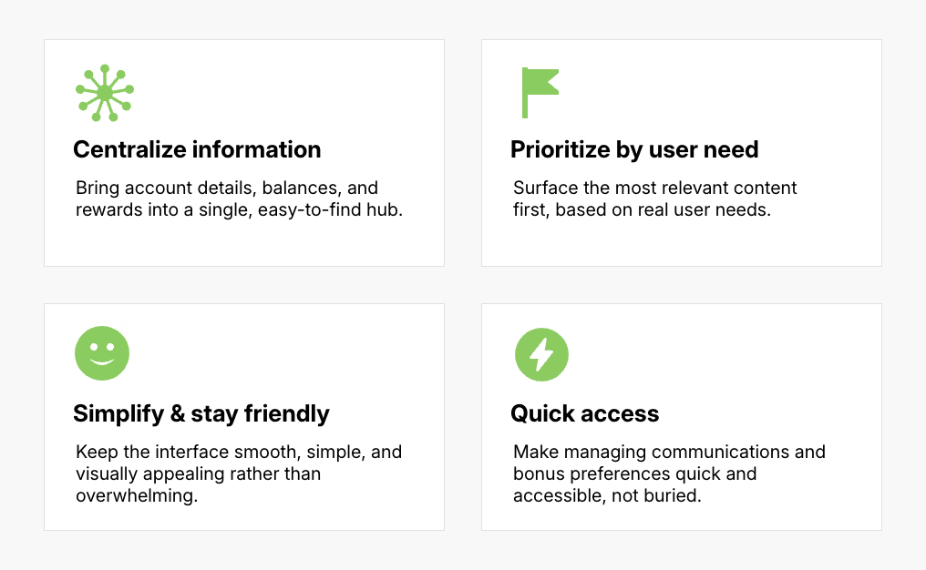
Working closely with Customer Service and Product to understand what mattered most to users, we established four principles to guide the redesign.
Validation
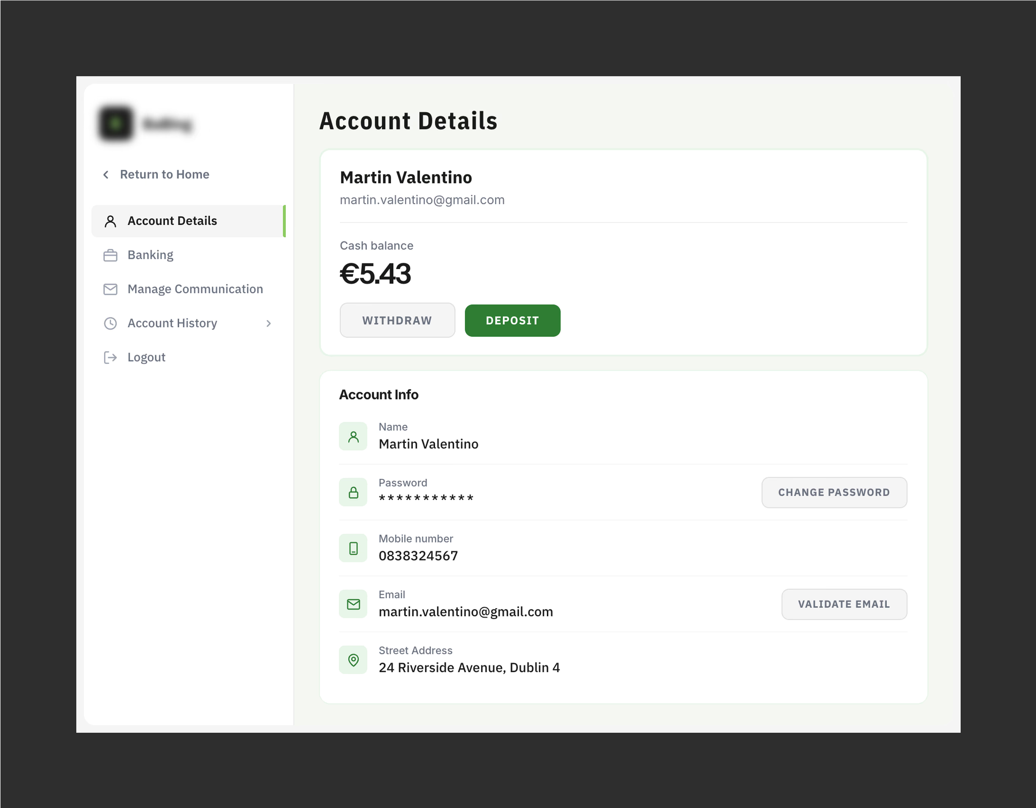
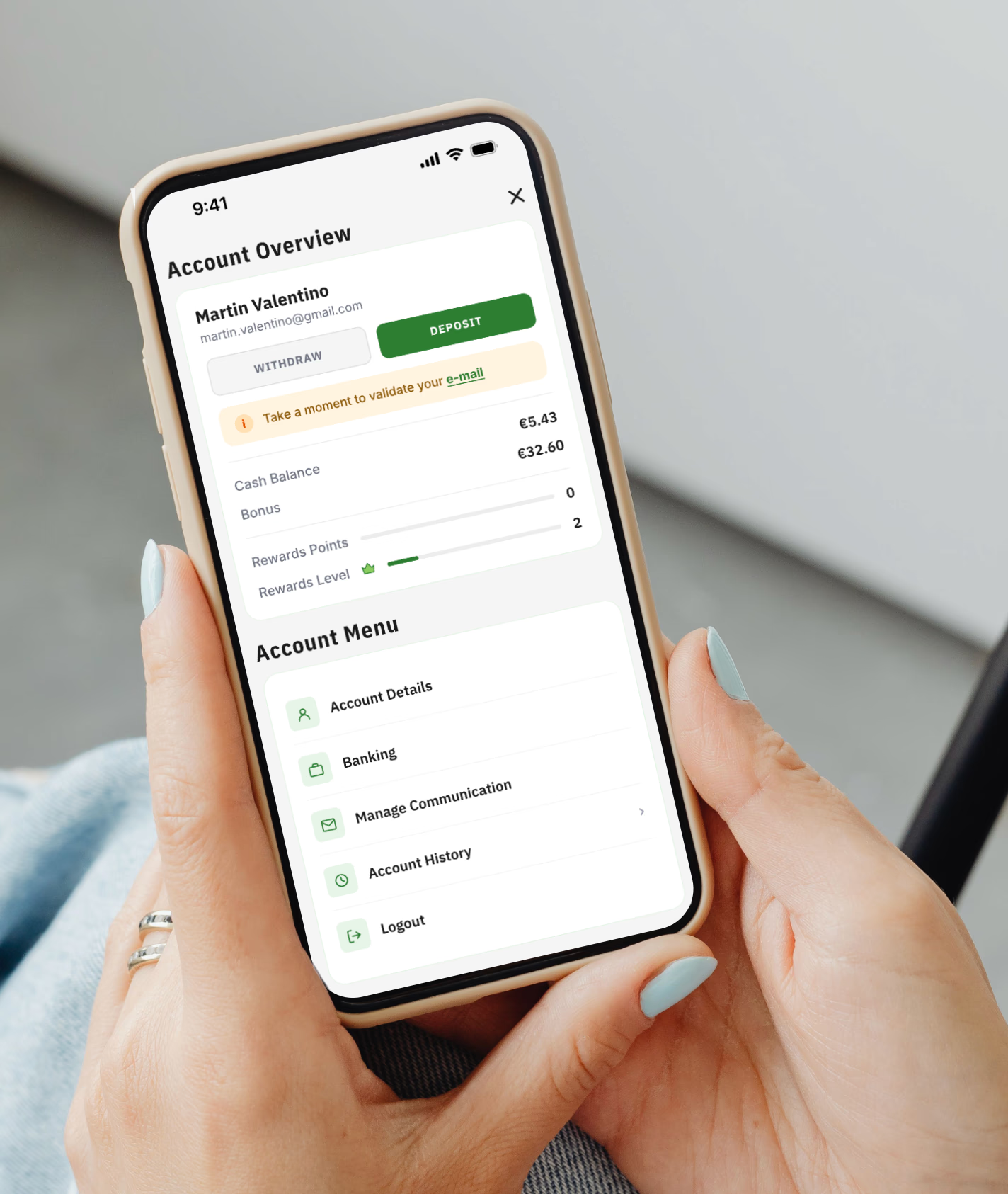
We brought account details, balances and rewards together into a single account hub, reducing the amount of navigation required to access frequently used information.
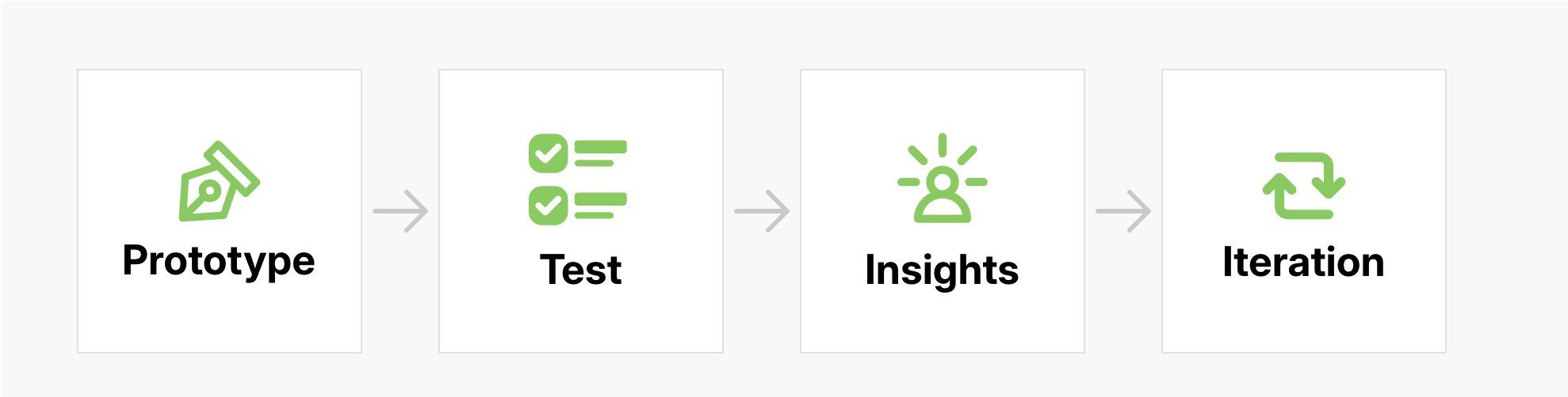
We then validated the concepts through iterative usability testing, starting with low-fidelity interactive prototypes and progressively refining the experience through higher-fidelity prototypes. Each round of testing helped identify usability issues and informed the next iteration, with a focus on making key account tasks easier to find and complete.
Making Withdraw easier to find Testing revealed that the Withdraw action was difficult to discover within the Banking section, despite being an important task. We surfaced it directly within My Account to improve access.
Removing redundant information Testing showed that some information in Account Details duplicated content already available elsewhere. We prioritised the most relevant information and removed unnecessary content.
Clarifying navigation labels The repeated use of "My Account" for both the section and its navigation entry caused confusion. We renamed the section "Account Details" to better reflect its content.
Designing for Scale
The redesign wasn't intended as a one-off visual refresh. It established reusable interaction patterns and information architecture that could be applied consistently as the product ecosystem expanded.
The experience was also designed to work seamlessly across desktop and mobile, reflecting the fact that most users would access the product on mobile. This required adapting the information hierarchy and interactions to different screen sizes and usage contexts, while maintaining a consistent experience across devices.
In some cases, mobile required information or actions that were already visible elsewhere on desktop to be surfaced directly within My Account. Designing for these differences helped ensure the experience remained usable and complete regardless of how users accessed the product.
This allowed the team to build new experiences on a shared foundation rather than solving the same interaction and navigation problems independently across each product.
Outcome
The redesign transformed My Account into a more coherent and intuitive experience, simplifying common journeys and establishing reusable patterns that were adopted across two products and six brands.
It also helped establish a stronger user-centred design foundation as the company expanded from a single product into a growing multi-brand platform.