Financial Institutional Portal Transformation
Transforming how institutional clients manage their portfolios
- Web Application
- Product
- Fintech
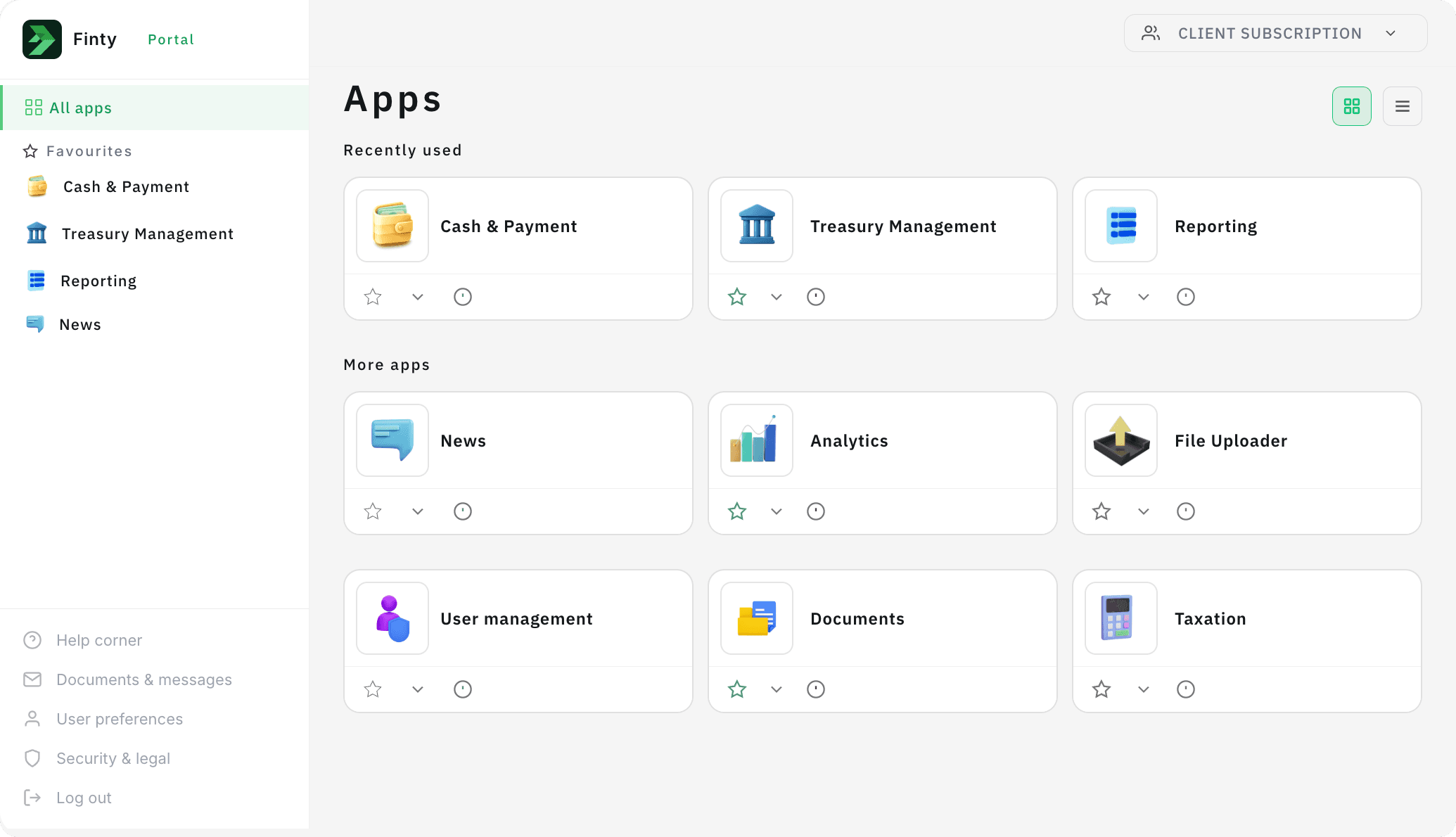
Visuals have been recreated due to confidentiality restrictions.
- Role
- Lead Product Designer
- Scope
- Global institutional client portal
- Target
- Reduce friction across complex user workflows
My Contribution
- Led design direction
- Facilitated stakeholder alignment
- Conducted and synthesized research
- Defined experience principles
- Collaborated with engineering and product
Key Outcomes
- Repositioned the portal from a reporting tool into a broader digital platform
- Reduced friction across complex client workflows
- Improved access to information and reduced manual workarounds
- Established a scalable foundation for future growth and integrations
Overview
I led the redesign of a global institutional client portal as part of a multi-year transformation program focused on improving how clients access information, manage portfolios, and interact with digital services.
Working across Product, UX, Business, and Engineering teams, the initiative involved modernising a complex ecosystem shaped by legacy systems, fragmented workflows, and evolving business priorities.
The Problem
The portal had gradually become difficult to navigate and was increasingly perceived as a legacy reporting tool rather than a digital platform supporting end-to-end client needs.
Users struggled with:
- fragmented journeys across disconnected systems
- difficult workflows and inefficient task completion
- poor information architecture
- limited awareness of available services
- manual workarounds to compare and reconcile data
Research revealed users frequently switched between screens, captured screenshots, and manually recorded information to maintain context while completing tasks.
Key Challenges
Navigating complexity across systems and stakeholders
The portal relied on multiple legacy systems and data sources, creating constraints around how information could be accessed and presented.
At the same time, the platform supported multiple business domains, requiring alignment across Product, UX, Business, and Senior Management stakeholders while balancing delivery timelines and long-term transformation goals.
To support alignment across teams and senior leadership, I also collaborated with cross-functional partners to create a vision video that communicated the future experience and helped build momentum and buy-in for the transformation.
From vision to execution
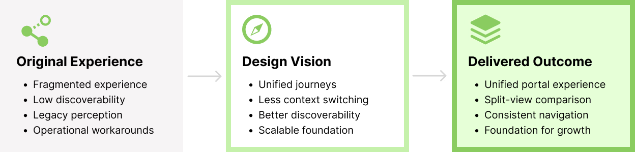
To address platform fragmentation and delivery constraints, we defined a future-state vision while prioritising improvements that could deliver value incrementally.
Designing for real user behaviour
One of the strongest insights from user research challenged common design assumptions.
While modern interfaces often prioritise whitespace and minimalism, institutional users prioritised information density and wanted to maximise visible data to support decision-making and reduce navigation effort.
This shifted our approach away from simplification through reduction and toward designing for efficiency, visibility, and preserving context.
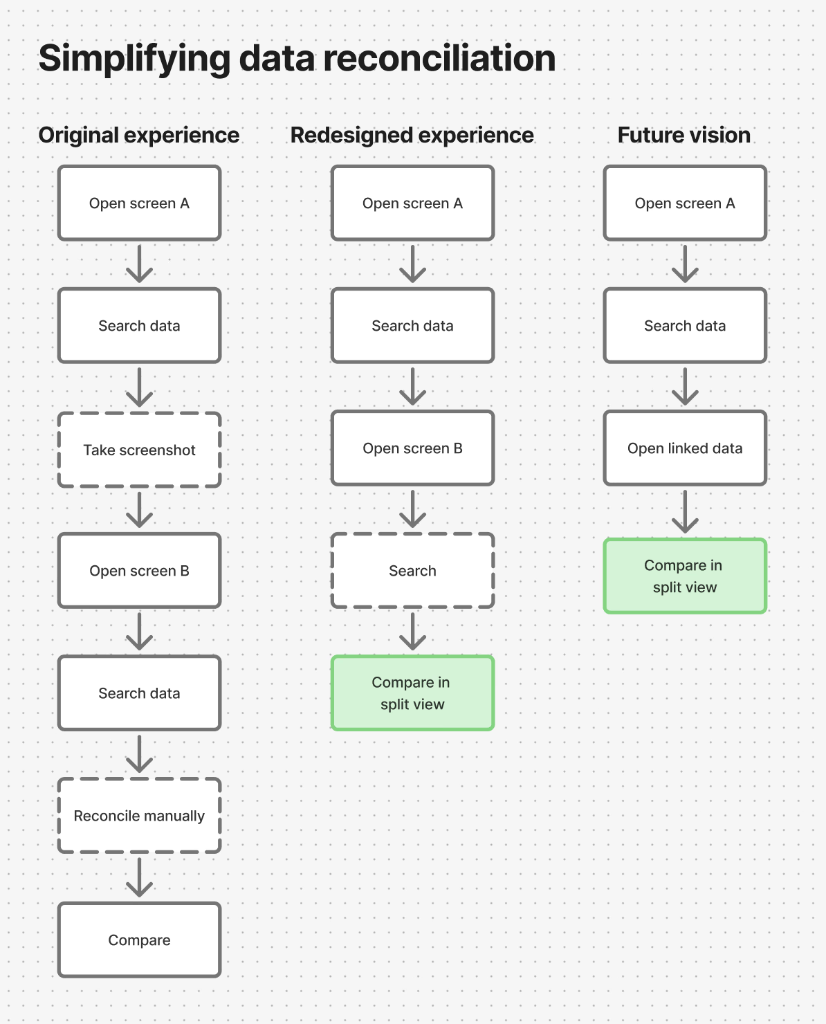
Research also revealed that users frequently developed workarounds to compare information across the platform, including taking screenshots and manually reconciling data to avoid losing context.
This insight informed new interaction patterns designed to support comparison directly within the workflow.
Design Principles & Focus Areas
The redesign focused on:
- reducing context switching across workflows
- improving access to related information
- creating clearer navigation and information architecture
- enabling future integration with internal and third-party applications
- supporting global usage through localisation and scalable layouts
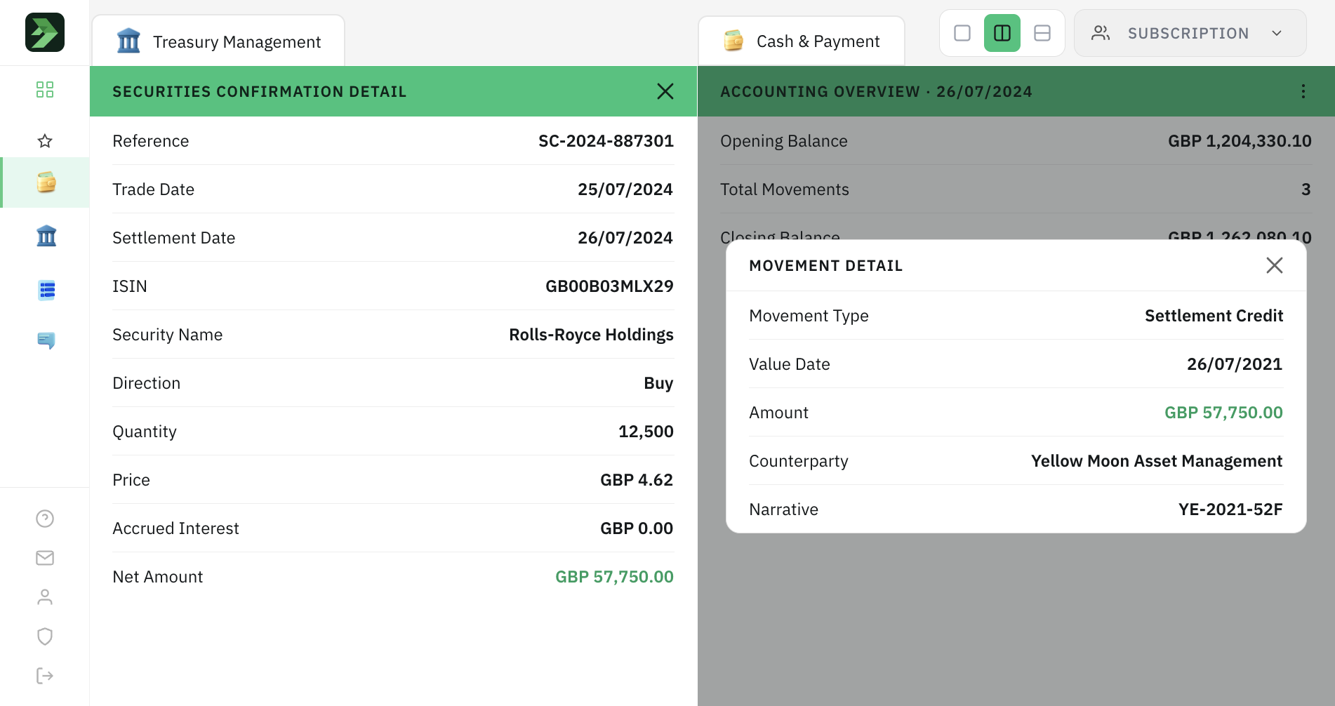
One of the solutions introduced was a split-view experience that allowed users to compare information across the platform without losing context during complex reconciliation tasks.
Rather than redesigning the entire platform at once, we prioritised the areas with the greatest user impact and deliberately deferred lower-priority improvements to later phases to maintain delivery momentum.
Outcome
The redesign helped reposition the platform from a fragmented reporting experience into a stronger foundation for future digital services.
While not every area could be transformed within the initial delivery scope, the work established principles and capabilities that supported continued evolution across subsequent phases.