Building a Design System at Scale
Establishing a shared design language, component library and governance model to improve consistency across 100+ applications.
- Design System
- Product
- System Thinking
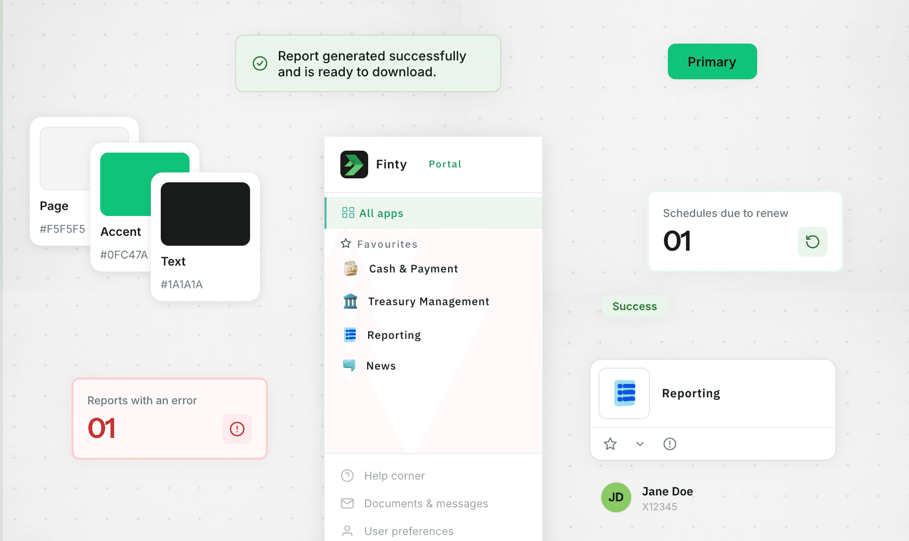
Visuals have been recreated due to confidentiality restrictions.
- Role
- Lead Product Designer
- Scope
- Design system for institutional applications
- Target
- 100% adoption across the Institutional Portal ecosystem
My Contribution
- Led the overall visual language and design direction of the system
- Worked with designers to define and validate reusable components / patterns
- Established the governance model, review process and contribution model
- Led the migration of the system's tooling from Sketch/InVision to Figma
- Worked directly with Engineering to validate implementation and behaviour
- Drove communication and alignment across Design, Development and Business
- Continue to lead the team owning the system today
Key Outcomes
- Achieved 100% adoption across all internally built Institutional Portal applications
- Design system used across 100+ applications
- Established a shared design language and reusable component foundations
- Created a governance model to support contribution and ongoing evolution
Context
When I joined the organisation, the Institutional Portal was entering a major technology modernisation programme. The existing product had accumulated inconsistencies over time, creating an opportunity to establish a more coherent visual language alongside the technical upgrade.
The programme was primarily focused on addressing technical debt, so major UX changes were deliberately outside its scope. This created a specific challenge for Design: improve the quality and consistency of the interface without turning the migration into a wider product redesign.
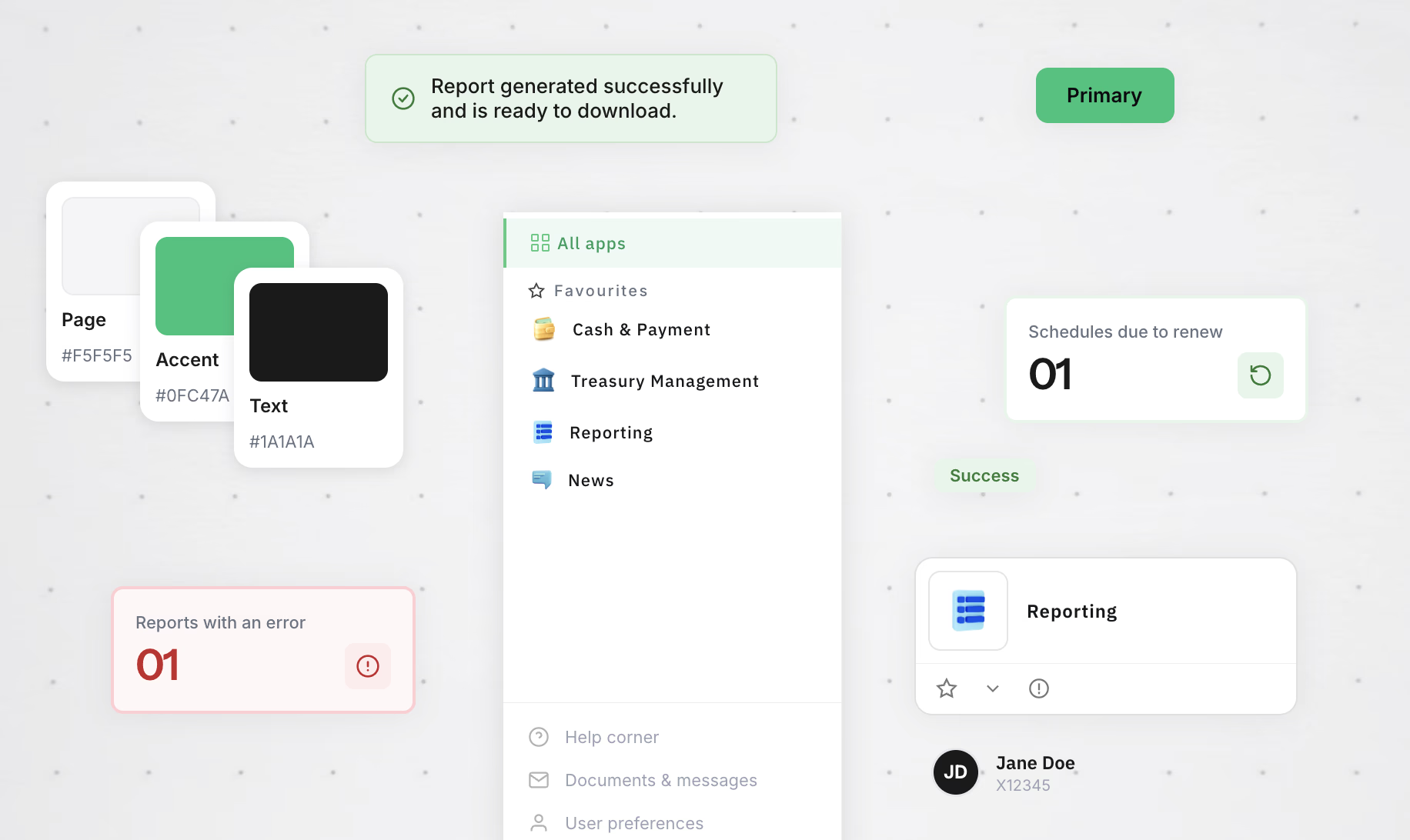
I took ownership of the initial UI kit, which had been built in Sketch and InVision, and built it out into a governed system.
Establishing the Foundations
We started by creating the first shared design library, defining the visual language and establishing reusable components that could be implemented as part of the technology upgrade.
I worked alongside other designers on the design and validation of components, while taking responsibility for the overall visual direction and ensuring that the system remained coherent as it evolved.
The focus wasn't only on creating individual components. We wanted to establish patterns that could be reused across products and provide teams with a consistent foundation to build from.
Designing with Engineering
From the beginning, the Design System was developed closely with Engineering rather than being designed in isolation.
During the initial implementation, I worked directly with developers through regular, often daily, sessions. We reviewed implementations together, checked that the intended visual design was being followed, and validated component behaviour and states.
This close collaboration helped us identify gaps between the design and implementation early, while making sure that the components being built were practical and reusable in the product.
One example: the list builder component was originally built to work only inside a modal. When a team building a separate feature needed to use it directly within a page, we discovered the implementation couldn't support that context. We updated the component so it could be used flexibly, in a modal, a page, or a panel, rather than building a separate one-off version for the new use case, keeping the system's component count from growing unnecessarily.
Creating the Operating Model
As the system grew, I established the governance and processes needed to keep it coherent and sustainable.
This included defining:
- contribution and review processes
- roles and responsibilities across teams
- regular design-system ceremonies and their frequency
- how new proposals were validated
- communication channels and guidelines
We looked at established design systems to understand how other teams approached contribution and collaboration. We used ideas from the Nord Design System as a starting point.
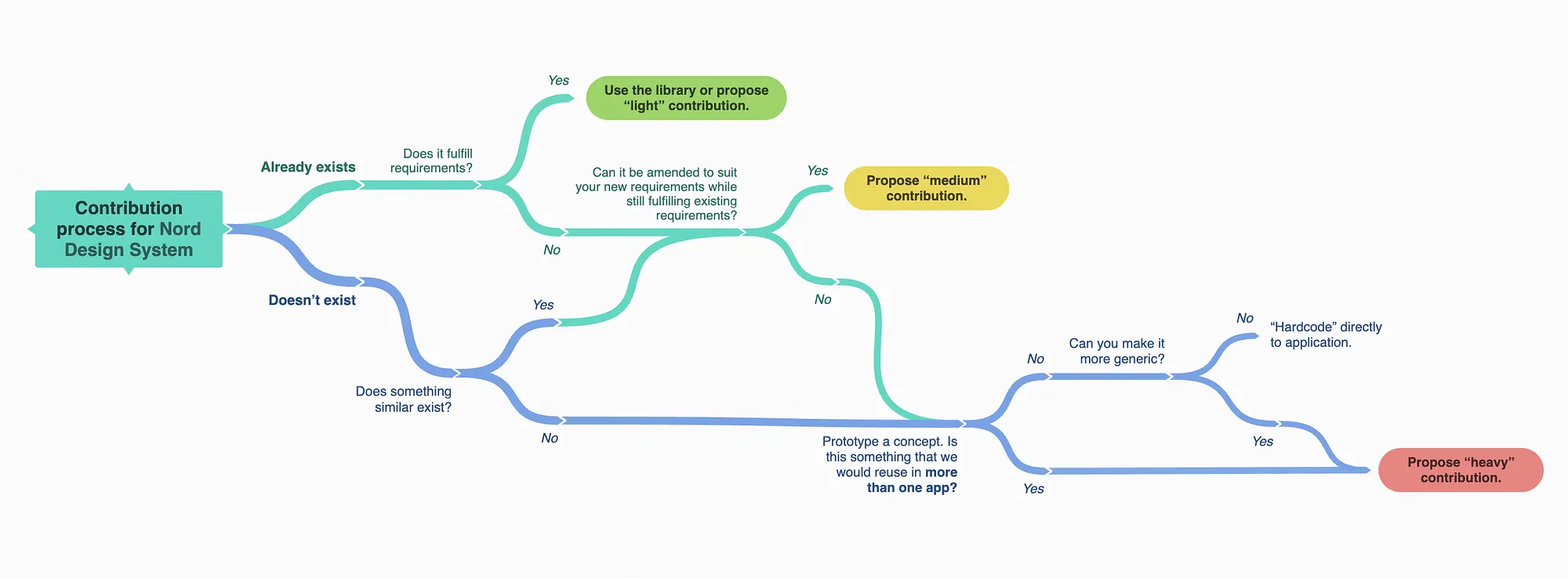
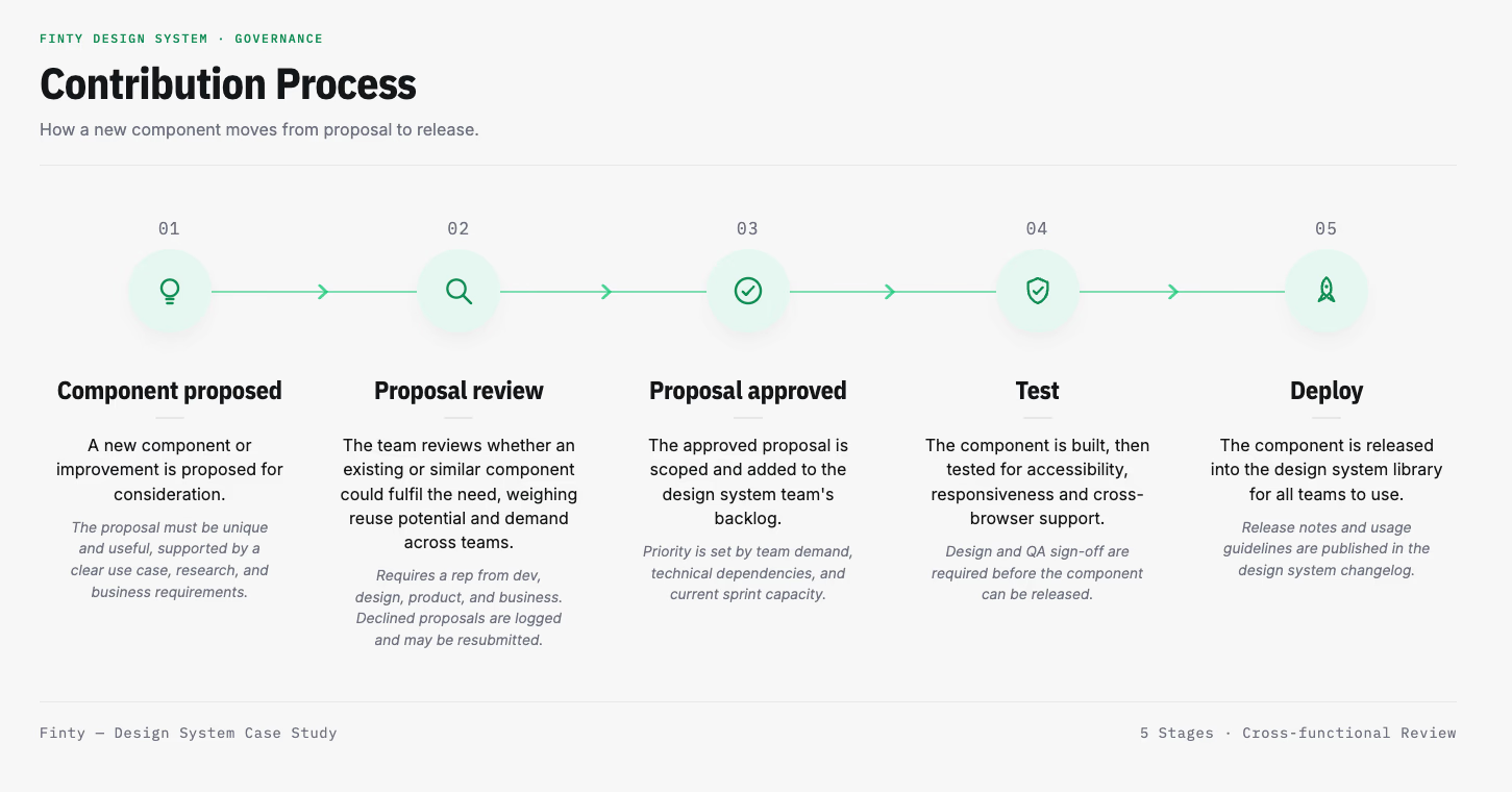
We then adapted those ideas to fit our teams, responsibilities and ways of working, creating a contribution process that defined how new components could be proposed, reviewed, validated and introduced into the system.
The governance model wasn't right the first time. Proposal review meetings initially ran monthly, for an hour. In practice, that cadence was too slow: teams needing a component were stuck waiting weeks for review, which pushed some toward workarounds instead of using the system properly. Based on that feedback, I changed the meetings to run fortnightly instead of monthly, but shortened them to 30 minutes. The goal was to evaluate requests faster without asking stakeholders for more of their time overall: same total time commitment, delivered in a way that unblocked teams sooner.
Migrating the System's Tooling
Once the design system was established and governed, the tools it was built in became a limitation of their own. The original library lived in Sketch and InVision. I'd already been making the case internally to move to Figma as a better long-term platform for a system at this scale. When InVision announced it was shutting down, I used that as the trigger to execute the migration I'd already been advocating for.
I scoped the migration and hired a temporary vendor designer to help rebuild the component library; most components couldn't be directly ported from Sketch and had to be reconstructed from scratch to take advantage of Figma's variants and interactive states. I defined the scope of the vendor's work and reviewed the migrated components against the existing system.
Adoption wasn't fully smooth: Figma wasn't yet approved org-wide, so team members had to individually request IT access before they could use it, something outside my control, which I mitigated by putting together a self-serve guide to speed up the unblocking process. Once adopted, the richer prototyping capabilities meant engineering could see intended behaviour directly in prototypes rather than relying on static InVision flows, reducing back-and-forth during handoff.
Scaling Adoption
The Design System was initially created to support the Institutional Portal, but we intentionally designed it to provide a foundation that could be used across the wider product ecosystem.
It was subsequently adopted across all internally-built Institutional Portal applications and expanded to support internal applications.
This meant teams could build on a shared visual language and established patterns instead of repeatedly solving the same component and interaction problems independently.
- 100+ applications — Design System adoption across the wider application ecosystem
- 100% adoption — Across all internally-built applications within the Institutional Portal ecosystem
Outcome
The project established the foundations for a shared design language across a complex application ecosystem, and three years on, that foundation has proven durable: it has survived a tooling migration, a governance model revision, and a change in who leads it day-to-day.
Beyond the components themselves, the work created a way for Design, Development, Business and Digital teams to contribute to and evolve a common system.
The result is a Design System that supports consistency at scale, gives teams a reusable foundation for building new experiences, and continues to require, and receive, active investment in its evolution.